Regarding ad campaigns, most marketers assume the secret sauce to higher conversion rates lies entirely within their ad platform—better copy, improved targeting, smarter bidding strategies. But here’s a surprising truth: some of the most significant performance boosts happen not within the ad interface, but after someone clicks your ad. Yes, I’m talking about your landing pages, specifically the Call-to-Action (CTA).
If you’re seeing plenty of clicks but fewer conversions, it’s time to scrutinize your CTAs. After all, an ad’s job is to earn the click, but the landing page’s job is to seal the deal. Unfortunately, this is exactly where many marketers trip up.
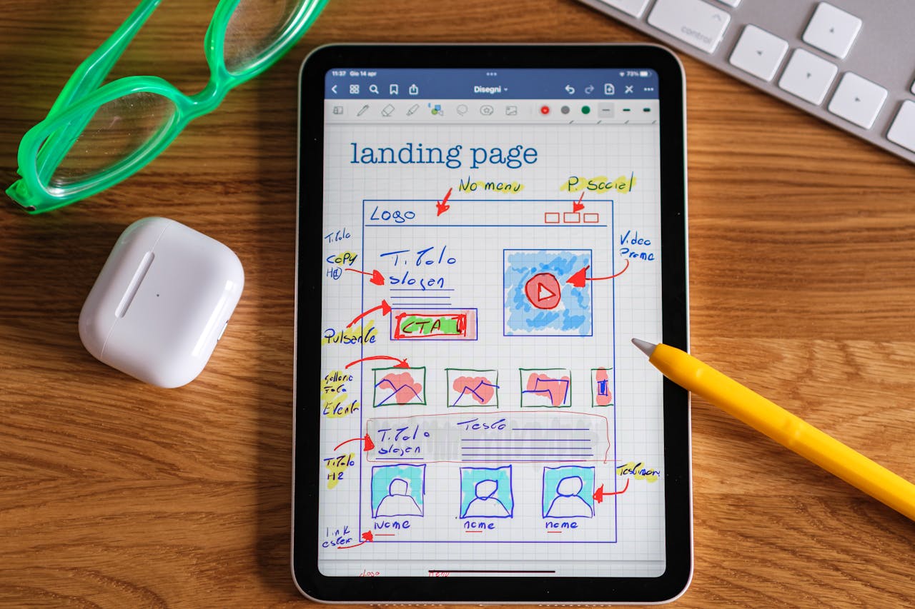
What Makes a CTA Fail?
Your CTAs might be clear, concise, and even beautifully designed, but they can still underperform. Why? They often promise effort rather than relief, a subtle yet crucial difference that can drastically impact conversion rates.
Think about it: How often do you encounter CTAs demanding you “try,” “sign up,” or “download”? These verbs signal work and commitment—two things most people instinctively resist. They suggest a task to be completed rather than a problem solved or a benefit received.
Let’s dive deeper into the common pitfalls and the psychological principles behind successful CTAs:
Mistake #1: Promising Effort, Not Relief
- Typical CTA: “Start building for free”
- Better Alternative: “See your data in one click”
The difference here is subtle but profound. “Start building” feels heavy, suggesting the user will need to do substantial work. In contrast, “See your data” promises immediate insight and clarity—both highly desirable outcomes that imply ease and relief.
Mistake #2: Creating Chores Instead of Solutions
- Typical CTA: “Plan your next campaign today”
- Better Alternative: “Steal our proven campaign blueprint”
The first example sounds like an assignment—tedious, possibly intimidating. The second feels like a gift. It implies value, ease, and immediate benefit, greatly reducing friction.
Mistake #3: Pushing Action Rather Than Pulling Desire
- Typical CTA: “View plans”
- Better Alternative: “Find the right plan”
“View plans” is neutral—almost clinical—and lacks emotional pull. “Find the right plan” gently appeals to the user’s desire for tailored solutions, personalization, and certainty.
Mistake #4: Triggering Resistance Instead of Curiosity
- Typical CTA: “Request a demo”
- Better Alternative: “See it in action”
The word “request” immediately conjures up thoughts of waiting, scheduling hassles, and sales pitches. “See it in action” is intriguing and implies immediate access, engaging curiosity rather than hesitation.
Mistake #5: Screaming Commitment Instead of Quick Wins
- Typical CTA: “Request access”
- Better Alternative: “Get early access”
Again, “request” signals uncertainty and delay. “Get early access” positions the user as privileged, offering exclusivity and immediate reward.
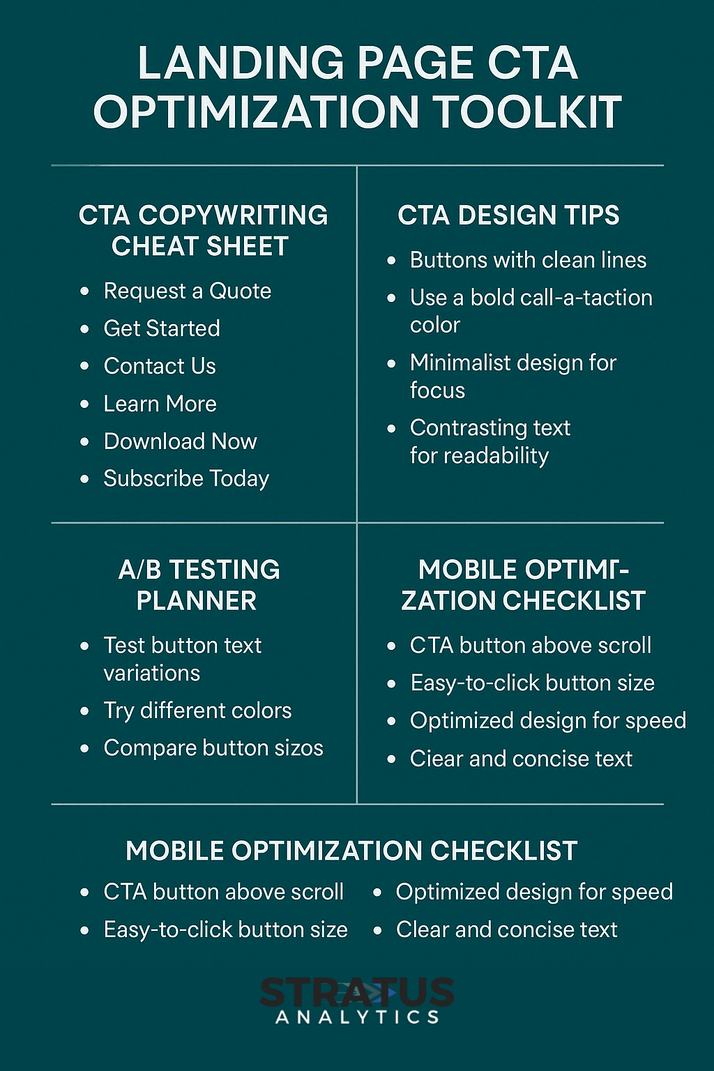
How to Align CTAs with Broader Marketing Goals
Beyond fixing the language, consider whether your landing page and CTA align with your overall marketing strategy:
1. Align Your Ad Strategy with Big-Picture Goals
Ensure your CTAs resonate with your overarching marketing and business objectives. If your goal is to enhance user engagement, tailor your CTA to emphasize interactivity or value-based interaction rather than passive consumption.
2. Revisit Your Buyer Groups
For complex sales cycles involving multiple stakeholders, make sure your CTA speaks clearly to the decision-makers involved. Adjust messaging to address specific pain points and desired outcomes for each segment of your audience. If your CTA doesn’t resonate with their needs or stage in the buying journey, clicks will rarely convert.
3. Post-Click Experience is Crucial
The magic truly happens post-click. A user’s journey from curiosity to conversion depends heavily on what happens after they click your ad. Your landing page, especially the CTA, must smoothly transition users from casual interest into confident action.
Instead of generic or labor-intensive calls to action, focus on crafting messaging that communicates ease, immediacy, and value.
Making CTAs Feel Like a Win
Remember this simple psychological principle: people click buttons that feel rewarding. Your CTA should never feel like signing up for a chore—it should feel like unwrapping a gift.
So next time you’re writing a CTA, ask yourself:
- Does this button feel like work or relief?
- Does it spark curiosity or trigger resistance?
- Does it align with the user’s emotional journey and the broader objectives of the campaign?
Real-world Impact
Marketers who apply these principles often see immediate improvements:
- Increased click-to-conversion ratios
- Higher engagement rates
- More effective utilization of ad spend, as fewer clicks go to waste
This approach doesn’t just improve campaign performance; it enhances the overall customer experience, fostering stronger connections and trust with your audience.
Final Thoughts
The next time you find yourself obsessing over tweaking your ad platform settings for incremental performance boosts, remember the power that lies in your landing page CTAs. Small linguistic and psychological tweaks here can deliver disproportionately large gains.
In the end, improving your CTAs is not just about making a button prettier or clearer. It’s about understanding human behavior and motivation deeply enough to craft a message that resonates, excites, and compels action. When you stop treating your CTA as a mere afterthought and start seeing it as the critical touchpoint it is, you’ll unlock entirely new levels of campaign effectiveness.

Hi there! I’m Scott, and I am the principal consultant and thought leader behind Stratus Analytics. I have a Master of Science degree in marketing analytics, and I’ve have been providing freelance digital marketing services for over 20 years. Additionally, I have written several books on marketing which you can find here on Amazon or this website.
DISCLAIMER: Due to my work in the packaging industry, I cannot take on freelance clients within the packaging manufacturing space. I do not want to provide disservice to your vision or my employer. Thank you for understanding.